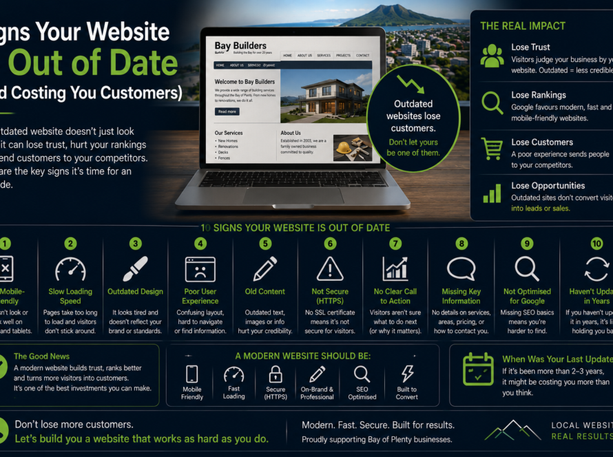
Most people who visit your website are on a phone — so if your site is hard to read, slow, or fiddly to tap on mobile, it’s failing the majority of your visitors before they even reach the good stuff. Mobile-first isn’t a nice-to-have; it’s the baseline.
Why mobile comes first
For local businesses, the figure is often well over half of all traffic on phones — someone standing in a car park searching “open now”, or on the couch checking you out before they call. Google also indexes the mobile version of your site first, so a poor mobile experience drags down your rankings everywhere.
What “mobile-first” actually means
- Readable text without pinching and zooming.
- Tap targets — buttons and links big enough for a thumb.
- Fast loading on a mobile connection, not just on office wifi.
- Click-to-call and easy contact right where a phone user expects it.
- Content that reflows cleanly instead of breaking the layout.
How to check yours
Pull your site up on your own phone and try to do what a customer would: find your hours, see a price, make contact. If any of it is awkward, your customers feel it too. Then load it on mobile data, not wifi, to feel the real speed.
The fix is structural
True mobile-first performance comes from a clean, lightweight build — not from bolting a mobile view onto a heavy desktop site. We build mobile-first from the start, so your site is fast and effortless on the device most of your customers actually use. See our web design or get a website audit.
FAQ
Isn’t my site already “responsive”?
Responsive means it resizes — but it can still be slow or clumsy on a phone. Mobile-first means it’s designed to be excellent on mobile first, then scaled up.
Does mobile performance affect Google rankings?
Yes. Google uses mobile-first indexing and counts mobile speed and usability as ranking factors.
Can an old site be made mobile-friendly?
Sometimes, but if it’s built on heavy foundations a rebuild is often faster and cheaper than patching. An audit will tell you which.